Using icons without labels
We're stepping through Jakob Nielsen's "Top 10 web design mistakes" from 2021, but are still very relevant today. At number seven on the list, we demonstrate three different wedding sites and their use of a favourite icon, represented by a love heart (❤️), and how that can impact user experience.
Transcript of "Using icons without labels"
( Jakob Nielsen is presenting face-on to a live and recorded Zoom call, holding a paper sign with the words "#7 - Icons without labels" printed. )
NARRATOR:
Hello everybody, as we continue our way through the top 10 list of web design mistakes by NNG. Coming in at number seven is "icons without labels". Pretty straightforward one, but good to show some real-world examples.
Icons without labels really means "does this icon do what the user expects it to do?". And in Jakob's first example, he references a love heart, which is what I'll go through here on a couple of wedding sites that I've found.
( The Wedshed website is screencast. )
Now you'll see here, we've got a search button, but notice now we have three different heart icons. And the gist of labeling icons is to reassure the user that when they click, that icon, if it is something that is clickable, then it's going to do the intended action.
( When the narrator says "see here…", they indicate with the mouse cursor at the top of the webpage, a button with a love heart, next to a button with a magnifying glass. Underneath these two buttons, is a further two icons with love hearts. )
So first, we've already got a bit of a question around, is this button the same as this button? But because we have this third button with a plus sign, it probably indicates that, a favorite can be added.
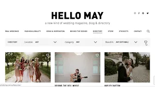
( The Hello May website is screencast. )
Now this of course assumes that your user understands that a heart is related to favouriting a certain page or profile. And we can see this theme across wedding sites. Here's our search. We've got a heart here. But again, now we've got very multiple hearts across each item. So when one language, we've got a plus sign where we can add favourites, the same heart is demonstrated to perhaps "add" and then "view all". But again, we have to click it to probably find out.
( When the narrator says "multiple hearts across each item", there is a heart icon in the site's main navigation, and "each item" is a link to a new page, previewed by a photo with a heart icon in the top-right corner of the photo. )
And in the case of this side, if we went to the desktop view, we're now getting a bit of a label, which is a good indicator of what those actions will actually, do. And in this case, we even got a tooltip to show that, this will view all favourites just like the repeat here.
The biggest trap is if you go into something like this and notice the profile page of this wedding site. We now have two hearts of the same, so we'll never actually know which one is which. Now the other issue with, icons without labels is if we go even further to an icon that perhaps people don't immediately identify with or question what's actual purpose is.
( The Easy Weddings website is screencast. )
The last website again another wedding one is, we've got the hearts, obviously, so it's a consistent theme. But here's an interesting idea here. We've got this wrap around to what's usually a hamburger menu. We've also got this joint person avatar looking icon. So we assume that it is to manage your profile and then we've got the hamburger to open up a menu, but we click on this and it immediately says we're a guest and we've got labels to suggest "my wedding venue".
So we probably do have a profile, but it's not created. And the "sign in" "sign up" kind of actions are blended into the, the, the bottom here, and I've also got some promotional material. Notice also that the hamburger is not really a hamburger. It's really just the same action, whether I click the hamburger menu or I click the avatar.
( When the narrator says "it's the same action", the resulting click on either the hamburger icon or the avatar icon produces the same drop-down menu and contents. )
So one could say, am I missing an additional menu somewhere? And indeed in the menu for mobile, avatar brings up that, that guest view, but the hamburger menu now presents a different menu. So do what icons should do and maintain consistency and where there is a bit of deliberation or uncertainty about what an icon should do, always refer to a label to assist in the user experience.
All right. I hope that was helpful. Ciao.